UI Module
UI Module include 3 sub module:
-
Block Menu
-
Block List
-
Cursor
Block Menu
Overview
BlockMenu provides a metro-style main menu. Compared with other menu forms, it is more suitable for VR/AR applications as it can be gazed at easily.

BlockMenu has the following main functionalities:
-
Show four square buttons centered at the gaze point, which ensure the shortest moving distances at all four directions.
-
Any menu button can be further expanded to sub-menus. Once the cursor moves over a button, it will automatically expand if it has sub-menus.
-
Sub-menus would automatically fold if the cursor moves away from it, to avoid a flood of buttons.
-
The main menu would also be automatically closed after a short period of time. Of course, manual close is also ok.
-
Menu buttons can display pictures and texts.
Menu Editor
BlockMenu has an editor to support easy-editing of the menus.
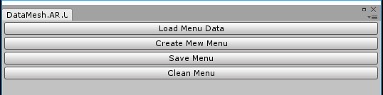
Open menu "Window->DataMesh->BlockMenuMaker" in Unity.

You will see the main interface of the editor:
Click "Create New Menu Configuration". Choose a location in the pop-up box to store the menue, and enter the name for the menu (e.g. "MainMenu.json") to save it as a JSON file.
Enter a name for the panel, which will be used as the unique ID of this panel in the app.

Click "Create Root Panel" button, and it will generate the first-level panel with 4 possible buttons.

You can choose to edit the add any of the four buttons.

Note that if you choose to use a rectangular picture as the backgroud for a button, you need to set its format as "Sprite(2D and UI)".

And you should place your backgroud pictures in "Assets/Resources/UI/Texture/" (If this directory not exists, create it manually). When referencing the picture, you only need to fill out its base name without directory and file extension.

If you need sub-menus, you can click "Create Sub Panel" and fill the information of sub-menus just like the main menu.

Note: The sub panel would block one of the buttons according to the position of its parent button, thus the sub panel has only three buttons available for use. If you want to show a menu button without binding any actions to it, you could uncheck the "Clickable" box so that the button would appear to be grey and unclickable when the menu pops up.
Lastly, do not forget to click "Save" button when you finish editing to save your work.
Save file is written in JSON, so you can check or modify the content by hand.
Prepare Your Project
- Create a Unity project and set it up accordingly for HoloLens apps (refer to doc "Configure Your Project" ).
- Set up METoolkit modules (refer to doc "Integrated METoolkit" ).
- Confirm to check UI and Input Modules in HoloEntrance.
Add a Menu
It's easy to add a menu to the scene, as you can drag the previously saved menu data (the JSON file) to the MenuManager.
- Find and choose "MEHolo/UIManager/BlockMenuManager" in the Hierarchy View.
- Locate the saved menu data from the Project view, and drag it to the "Menu Data List" property in the Inspector view of BlockMenuManager.

- Now you can see that the menu data have been imported.

Note: you can also create Menu with code in runtime.
Use a Menu
- Create an object named "App" in Hierarchy view.
- Add a new module with name "BlockMenuSample" and then save.
- Open the "BlockMenuSample" module to add the following codes:
using System.Collections;
using UnityEngine;
using DataMesh.AR;
using DataMesh.AR.UI;
using DataMesh.AR.Interactive;

public class MenuSample : MonoBehaviour
{
    private MultiInputManager inputManager;
    private BlockMenuManager menuManager;
    private BlockMenu mainMenu;

    // Use this for initialization
    void Start ()
    {
        StartCoroutine(WaitForInit());
    }

    private IEnumerator WaitForInit()
    {
        MEHoloEntrance entrance = MEHoloEntrance.Instance;
        while (!entrance.HasInit)
        {
            yield return null;
        }

        // Todo: Begin your logic
        menuManager = BlockMenuManager.Instance;
        mainMenu = menuManager.GetMenu("MainMenu");
        mainMenu.RegistButtonClick("button1", OnClickButton1);

        inputManager = MultiInputManager.Instance;
        inputManager.cbTap = OnTap;
    }

    private void OnTap(int count)
    {
        menuManager.OpenMenu(mainMenu);
    }

    private void OnClickButton1()
    {
        Debug.Log("Click Button!");
        CursorController.Instance.ShowInfo("Click Button!");
    }
}
- Now you can build and install the app to HoloLens to see the results.
- How to operate the menu? You can air-tap at any place to open the main menu. And if you gaze at the left-upper corner of any menu buttons, it will open its sub-menu if present, and if you air-tap at the same time you the hint text will show up.
Note: You can also use our demo code directly at "Assets/DataMesh/Samples/Menu".
Block List
Overview
Block List provide a metro-style list panel which has pages flip support.
- It will show 12 items per page (4 rows and 3 columns)
- each item can show name and icon
- if total items more than 12, page up and page down buttons will appear

How to use
- You can create a Block List from UIManager simply.
BlockList ui = UIManager.Instance.listManager.CreateBlockList();
- You need to set data into the list.
List<BlockListData> dataList = new List<BlockListdata>();
for (int i = 0;i < 30;i ++)
{
    BlockListData data = new BlockListData();

    /* set item name */
    data.name = "Name_" + i;

    /* set item icon. it will be a url, because it will be downloaded automatic after ui is shown */
    data.icon = "http://localhost/pic/item_pic.png";

    /* the data can be anything you like. */
    data.data = null;

    dataList.Add(data);
}

/* set items into UI. the second param is current page, and the third is total item count */
ui.SetData(dataList, 1, 30);
- Then, you need to bind callback function to Block List
ui.AddCallbackChangePage(OnChangePage);
ui.AddCallbackClick(OnClickResource);
ui.cbClose = OnUIClose;
CallbackChangePage will invoke when user click page up or page down button.
CallbackClickResource will invoke when user click a item.
CallbackClose will invoke when user click "cross" button on the right top.
- You can write callback function like this
    private void OnChangePage(int page)
    {
        Debug.Log("new page is " + page);
    }

    public void OnClickResource(BlockListData data)
    {
        Debug.Log("Click item " + data.name);
    }

    private void OnUIClose()
    {
        ui.Hide();
    }
Cursor
Overview
Cursor helps users to get accurate gazing positions, much like a mouse cursor. It could also be used to carry some context information.
Cursor type
CursorController provide 3 cursors:
- Normal: means can not interactive. If gaze not hit object or object's layer is not in layer mask, cursor will show Normal.
- Hand: means can interactive. if gaze hit a object and object's layer is include in layer mask, cursor will show Hand.
- Loading: means app is in loading state. if IsBusy attribute set to true, cursor will show loading.
CursorController also provide a special cursor called Info cursor. Info cursor always appear in the fixed distance from user eyes, independent of objects in the scene. It can use to show some information. When info cursor is showing, other cursors will disappear.
Moreover, CursorController can show a temporary information at the gaze point. This kind of information will float up slowly, and disappear after a while. It can use to show some temporary status of apps, like error information.
Use CursorController
-
Create a Unity project and set it up accordingly for HoloLens apps (refer to doc "Configure Your Project" ).
-
Set up METoolkit modules (refer to doc "Integrated METoolkit" ).
-
Confirm to check UI and Input Modules in HoloEntrance.
-
Select CursorController object under UIManager object

- You can set the prefab of all kinds of cursor here as you like.
- By default, the prefab of Info Prefab is null. You can put your own prefab here, if you need.
- Info Prefab is the temporary information container. You don't need to change it in common, unless you want to make your own info UI.
- By default, the cursor will fitting the surface of hit object. If you want your cursor always face to camera, check Cursor Face To Camera, or set this variable to true in your code.
- You can select the layer mask which you want to interactive.
- Note: This layer mask is different from MultiInputManager.layerMask. It means, you can make a object can be gazed, but the cursor show normal not hand.
-
You can set the distance between cursor and hit object, and default is 0.01 meter (1cm).
-
Until now, the cursor will work fine, without any coding work.
More about CursorController
- Developers can manually turn the CursorController on or off by the following codes:
    UIManager.Instance.cursorController.TurnOn();  // Enable CursorController
    UIManager.Instance.cursorController.TurnOff(); // Disable CursorController
- You can display some temporary information on the Cursor by following code:
UIManager.Instance.cursorController.ShowInfo("I want to show some information!");
- Cursor could be used to report a "busy" status to users. That is, developers can set the status of a cursor to "busy" so that the cursor would turn into a "loading" icon to send a "busy" message to the user.
UIManager.Instance.cursorController.isBusy = true;
Note: The code above sets the Cursor to a "busy" status. However, this status is merely a visual display and the app is not interrupted at all, which means users could still operate under the busy status. To actually block user operations, you need extra codes to do it.